QR Code "Scan Me" Frames & Calls to Action That Boost Scans (2026)
A bare QR code gets ignored. A simple frame and a clear call to action can dramatically increase how many people actually scan. Here is how to design QR code frames and CTAs that boost scans in 2026.

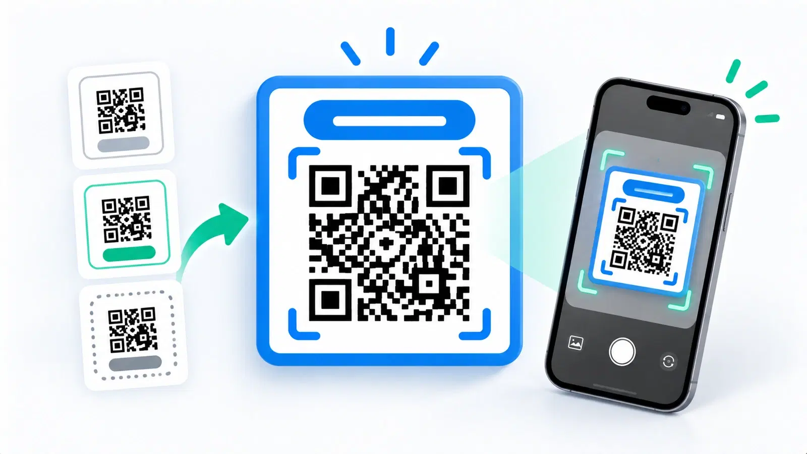
Here is an uncomfortable truth about QR codes: a technically perfect code that nobody scans has achieved nothing. The hardest part of a QR code is rarely the technology, it is getting a human to notice it and choose to scan. And a bare QR code, floating alone with no context, gets ignored constantly.
The fix is simple and often dramatically effective: a frame and a clear call to action. A short instruction like "Scan for the menu" and a simple border around the code turn an ignorable square into an obvious invitation. This small addition regularly lifts scan rates, because it answers the two silent questions every potential scanner has: what is this, and why would I scan it?
This guide covers how to design QR code frames and calls to action that actually boost scans in 2026: why they work, what your CTA should say, the design rules that matter, and the mistakes to avoid. It pairs well with the deeper motivational side in our psychology of QR code scanning guide; here we focus on the practical frame-and-CTA craft.
Why a Bare QR Code Gets Ignored
To design a frame that works, it helps to understand why the code needs one in the first place. It comes down to attention and motivation.
A bare code answers no questions. When someone sees a lone QR code, they instantly (and usually unconsciously) ask: what is this, and what do I get if I scan it? A bare code answers neither. Faced with uncertainty and no clear reward, most people simply move on. The code is not ignored because people dislike scanning, it is ignored because nothing told them why to bother.
Scanning takes a small but real effort. Pulling out a phone, opening the camera, and aiming it is a tiny action, but it is still an action that needs a reason. Without a clear payoff, the effort is not worth it. A CTA supplies the reason and makes the effort feel worthwhile.
Attention is scarce. On a busy poster, shelf, or street, a bare code competes with everything else and loses. It does not stand out or explain itself, so the eye slides past. A frame gives it visual presence, and a CTA gives it meaning.
The two jobs a frame-plus-CTA does: 1. Gets noticed - the frame gives the code visual weight so people see it. 2. Gives a reason - the CTA tells people what they get, so they choose to scan.
Solve those two problems and scan rates rise, often substantially. Everything else in this guide is about doing those two jobs well. For why motivation matters so much, see the psychology of scanning.
What Your Call to Action Should Say
The words matter. A good CTA is specific about the reward and easy to act on. Here is how to write one that works.
Be specific about the payoff. "Scan me" is better than nothing, but "Scan for 20% off" or "Scan to see the menu" is far better, because it names the reward. The more clearly the CTA tells people what they get, the more will scan. Specific beats generic every time.
Lead with the value, not the mechanism. People do not scan to "scan", they scan to get something. Frame the CTA around the benefit: "See today's specials," "Watch the demo," "Get the guide," "Leave a review," "Save $10." The action (scanning) is obvious from the code; the value is what you need to communicate.
Keep it short and clear. A CTA is read in a glance. A few words, plainly stated. Long sentences defeat the purpose. "Scan to book your table" works; a paragraph does not.
Add a light instruction if the audience may be unsure. For some audiences, a small "Point your phone camera here" reassures people who are less familiar with scanning. For most modern audiences this is optional, but it removes hesitation where scanning confidence is lower.
Examples of strong CTAs by goal:
- Menu: "Scan for our full menu"
- Discount: "Scan for 15% off your order"
- Reviews: "Scan to leave a quick review"
- Info: "Scan to learn more"
- Video: "Scan to watch how it works"
- Contact: "Scan to save my details"
Match the CTA to the destination. Make sure the CTA honestly reflects what is on the other side, and that the landing page delivers exactly what the CTA promised. A CTA that oversells and a page that underdelivers kills trust and future scans.
- Name the reward: "Scan for 20% off" beats "Scan me"
- Lead with the benefit, not the act of scanning
- Keep it to a few words, readable at a glance
- Add a light "point your camera here" only if the audience needs it
- Make sure the destination delivers exactly what the CTA promised
Frame Design Rules That Work
The frame is the visual packaging that makes the code noticeable and houses the CTA. Here is how to design one that helps rather than hurts.
Keep the frame simple and clean. A frame should draw attention to the code, not compete with it. A simple border, a clear space for the CTA text (usually above or below the code), and enough contrast to stand out. Avoid clutter; the code and the short CTA are the whole message.
Preserve the quiet zone inside the frame. This is critical: the frame must not crowd the code. Keep the clear margin (quiet zone) between the frame and the code itself, or you will hurt scannability while trying to boost scans. The frame goes around the quiet zone, not into it. See common QR mistakes.
Use contrast and, optionally, a brand color. The frame can carry a brand color to stand out and look intentional, while the code inside stays high-contrast (dark on light). A colored frame is fine; just keep the actual code scannable. See how to make a colored code that scans.
Make the CTA text legible. The CTA should be large and clear enough to read at the distance people will see it from. A tiny CTA under a code on a poster meant to be seen from across a room is wasted. Size the text to the viewing distance.
Consider a directional cue. A small arrow or "point your camera" indicator can nudge action, especially for less scan-savvy audiences. Subtle and optional, but it can help.
Keep it on-brand. A frame in your brand colors and style makes the code feel like a trustworthy, intentional part of your material rather than a random square, which itself encourages scanning (people scan things that look legitimate). See design and branding.
Pro Tip
The golden rule of QR frames: the frame goes around the quiet zone, never into it. In the rush to add a border and CTA, people crowd the code and quietly break its scannability. Keep the clear margin between your frame and the code itself, so the frame boosts scans without sabotaging them.
Mistakes to Avoid, and Measuring the Lift
A few common mistakes undo the benefit of a frame, and a little measurement tells you what is actually working.
Mistakes that hurt:
- Crowding the code. The most common error, letting the frame or CTA text intrude into the code's quiet zone and breaking the scan. Keep the margin.
- A vague or missing CTA. A frame with no clear value proposition ("Scan me" or nothing) wastes the opportunity. Name the reward.
- Overdesigning. A busy, cluttered frame competes with the code and confuses the eye. Keep it simple.
- A CTA the destination does not honor. Promising something the landing page does not deliver. Match them.
- Tiny, unreadable CTA text. Size it to the viewing distance.
- Forgetting mobile reality. Whatever the code opens must be excellent on a phone, since that is what everyone scanning is using. See landing page best practices.
Measure the lift (this is where dynamic codes pay off). Because the whole point is to increase scans, use a dynamic code so you can actually track them and see whether your frame and CTA are working. See what analytics can track.
Test and improve:
- Compare scan numbers before and after adding a frame and CTA.
- Try different CTA wording and see which earns more scans. See A/B testing QR campaigns.
- Keep what works, refine what does not.
The bottom line: A frame and a clear, specific call to action are among the highest-leverage, lowest-effort changes you can make to a QR code, because they fix the real bottleneck: getting noticed and giving a reason to scan. Keep the frame simple and off the quiet zone, make the CTA name a clear reward, ensure the destination delivers, and measure the lift. Do that, and far more of the people who see your code will actually scan it.
Conclusion
A perfect QR code that nobody scans is worthless, and the most common reason codes go unscanned is not technical, it is that a bare code answers neither "what is this?" nor "why should I scan?" A simple frame and a clear call to action answer both: the frame gets the code noticed, and the CTA gives people a concrete reason to act.
Write CTAs that name the reward ("Scan for 20% off" beats "Scan me"), lead with value over mechanism, and stay short and legible, and make sure the destination honors the promise. Design frames that are clean and on-brand, keep the CTA readable at viewing distance, and, above all, never let the frame intrude on the code's quiet zone, which is the classic way a scan-boosting frame quietly breaks the scan.
Because this is all about lifting scans, use a dynamic code to measure the difference, test different CTA wording, and keep what works. A frame and a specific CTA are among the cheapest, highest-impact improvements you can make to any QR code, so if your codes are not getting scanned, start here.
Related reading:
Create a trackable QR code with QRForever. Start a 7-day full-access trial, no credit card needed. Add a frame and CTA, then watch the scans in your analytics.
Explore QRForever Solutions
Ready to Create Your Own QR Codes?
Start creating dynamic QR codes for your business today. Track analytics, update content anytime, and never reprint again.
Related Articles
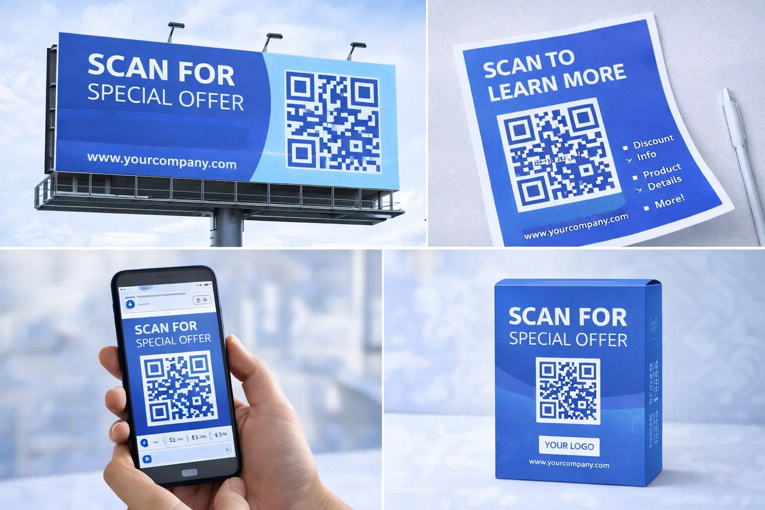
QR Code Marketing Strategy: 15 Campaign Types That Work in 2026
A practical QR code marketing playbook: 15 campaign types with real examples, a channel-by-channel breakdown, attribution setup, and the mistakes that quietly waste budget. Updated June 2026.
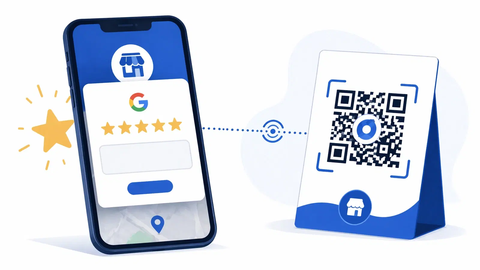
How to Create a QR Code for Google Reviews: Get More 5-Star Reviews in 2026
A Google Review QR code sends customers straight to your review page, no searching, no friction. Learn how to set it up, where to place it, and how businesses 3x their review count.
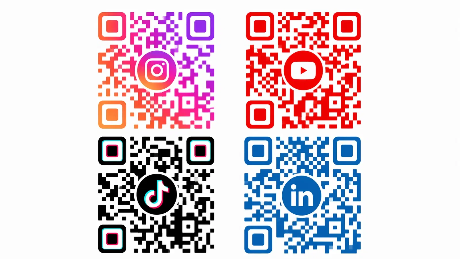
How to Create a QR Code for Your Instagram & Social Media Profiles in 2026
Link your Instagram, Facebook, YouTube, or any social profile to a QR code. Perfect for offline promotions, packaging, and events. Includes Linktree alternatives and multi-link setups.