How to Make a Colored QR Code That Still Scans (2026)
A colored QR code can match your brand beautifully, or it can quietly stop scanning. The difference is contrast. Here is exactly how to make a colored QR code that looks great and still scans reliably every time in 2026.

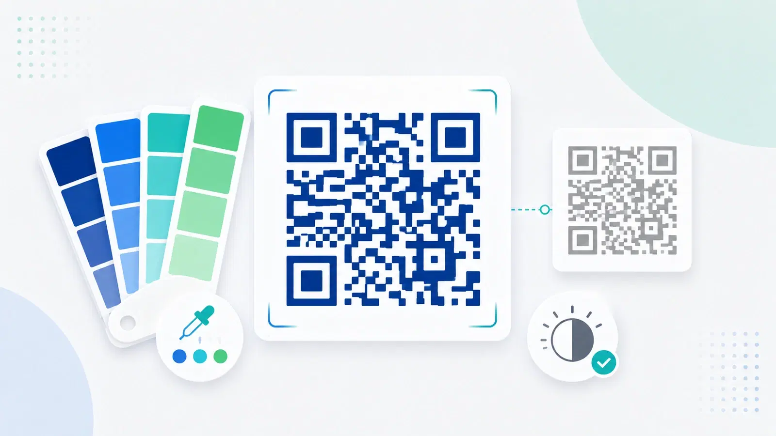
A plain black-and-white QR code works perfectly, but it does not always fit your brand. So people color them: brand blue, a gradient, a splash of personality. Done well, a colored QR code looks polished and on-brand. Done badly, it quietly stops scanning, and you often do not find out until it is already printed on a thousand flyers.
The good news is that making a colored QR code that still scans is not hard once you understand the one principle that governs it: contrast. Scanners do not care about color as such; they care about the difference between the dark parts and the light parts of the code. Get that difference right and you can use almost any color. Get it wrong and even a beautiful code fails.
This guide explains the contrast rule in plain terms, gives you safe color combinations, shows exactly what breaks a colored code, and walks through a step-by-step method to color a code confidently. For the broader visual side, pair this with our QR code design and branding guide; here we focus on one job, coloring a code without breaking it.
The One Rule: Contrast Is Everything
Everything about a scannable colored QR code comes down to a single principle, so it is worth understanding properly.
Scanners read contrast, not color. A QR scanner works by distinguishing the dark modules (the pattern) from the light background. It is essentially reading light and dark, not red and blue. This means color is fine, as long as your "dark" is genuinely dark and your "light" is genuinely light. The scanner needs a clear, strong difference between the two.
The safe formula: dark code on a light background. The reliable approach is a dark-colored code on a light-colored (or white) background. A deep navy, a dark green, a rich purple, a near-black brand color, any of these work well on white or a pale background, because they preserve strong contrast while adding color.
Why this matters more than it seems. A colored code that scans on your designer's high-quality screen in perfect light can fail in the real world: printed slightly differently, scanned on an older phone, in dim light, at an angle. Strong contrast is your safety margin against all of those real-world variations. The more contrast you keep, the more forgiving the code is. A code that barely scans in ideal conditions will fail in ordinary ones.
The simple mental test. Imagine your colored code in grayscale. If the dark parts would still look clearly dark and the background clearly light when the color is stripped away, you have enough contrast. If they would blur into similar grays, the code is at risk. This grayscale test is the quickest way to sanity-check a color choice.
Pro Tip
The fastest contrast check: picture your colored code in black and white. If the pattern still reads as clearly dark against a clearly light background with the color removed, it will scan. If the two would turn into similar shades of gray, the contrast is too weak and the code is at risk, no matter how nice the color looks.
Safe Color Combinations (and Ones to Avoid)
With the contrast rule in mind, here are combinations that reliably work and ones that reliably cause trouble.
Combinations that work well:
- Any dark color on white or a very light background. Navy, dark teal, deep green, maroon, dark purple, charcoal, all scan reliably on white. This is the safest and most flexible approach.
- A dark brand color on a pale tint of the same family. For example, a dark blue code on a very light blue background, as long as the background stays genuinely pale.
- Black or near-black code on a light colored background. A black code on a soft pastel background keeps strong contrast while adding a touch of color.
Combinations to avoid:
- Light code on a dark background (inverting). Many scanners struggle to read a light code on a dark field. It sometimes works, but it fails often enough that it is risky for anything printed. If you must, test relentlessly across devices.
- Two medium tones. A medium-blue code on a medium-gray background, or any two mid-tones together, kills contrast. This is the single most common cause of a colored code failing.
- Low-contrast pairings like yellow on white or pastel on pastel. Pale codes simply do not give the scanner enough to work with.
- Gradients that pass through light shades. A gradient is fine if it stays dark throughout, but if it fades toward a light color in places, the code can drop below scannable contrast there.
The rule of thumb: When in doubt, make the code darker and the background lighter. You can add plenty of brand personality within "dark on light," and it is far safer than clever inversions or subtle tone-on-tone effects that look sophisticated and fail in practice.
- Safe: any dark color (navy, deep green, maroon, charcoal) on white or a pale background
- Safe: black/near-black code on a soft pastel background
- Avoid: light code on a dark background (inverting) - unreliable
- Avoid: two medium tones together - the most common failure
- Avoid: yellow-on-white, pastel-on-pastel, and gradients that fade to light
What Else Breaks a Colored Code
Contrast is the main issue, but a few related mistakes commonly accompany coloring and are worth avoiding at the same time.
Coloring the wrong parts. Most good generators let you color the modules (the pattern) and the background separately, and sometimes the three large corner squares (the "eyes") too. The eyes help scanners orient the code, so keep them high-contrast and, ideally, do not get too creative with them. Coloring the pattern while keeping a clean light background is the safest split.
Losing the quiet zone. A colored design sometimes tempts people to extend color right to the edges or crowd decoration around the code. The code still needs its quiet zone, the clear margin around it, to be readable. Keep that margin clean regardless of your color scheme. See common QR mistakes.
Busy backgrounds behind the code. Placing a colored code over a photo or patterned background destroys contrast even if the code's own colors are fine. The area directly behind the code should be a clean, solid, light color.
Ignoring error correction. A code's built-in error correction gives it some tolerance for imperfection. Using a higher error-correction level adds resilience, which is helpful when you are pushing a code with color, though it is not a substitute for good contrast.
Adding a logo on top of color. Coloring and adding a logo are often done together, and both eat into a code's readability budget. If you are doing both, be extra careful. See our dedicated guide, how to add a logo to a QR code without breaking it.
Important
Do not color the three large corner squares (the finder patterns, or "eyes") with low contrast or heavy styling. Scanners rely on them to locate and orient the code. Recoloring them subtly can be fine, but low-contrast or heavily stylized eyes are a frequent, hard-to-diagnose reason a nicely colored code refuses to scan.
Step by Step: Color a Code That Scans
Here is a reliable method to color a QR code and confirm it works before it goes anywhere important.
1. Start with a dynamic code. Use a dynamic code so that if anything ever needs to change, you can update it without reprinting. Coloring is about appearance; a dynamic code protects the function. See dynamic vs static.
2. Choose a dark module color. Pick your brand color for the pattern, but keep it genuinely dark. If your brand color is light or medium, use a darker shade of it for the code itself and save the lighter tone for accents elsewhere.
3. Keep the background light and solid. White is safest; a very pale tint is fine. Make sure the area directly behind the code is a clean solid color, not a photo or pattern.
4. Keep the eyes and quiet zone clean. Leave the corner squares high-contrast and preserve the clear margin around the code.
5. Apply your color and do the grayscale check. Once colored, mentally (or actually) convert it to grayscale. If the contrast still reads clearly, proceed.
6. Test on multiple phones, in real conditions. This is the non-negotiable step. Scan the colored code with at least two or three different phones, including an older one if possible, in normal and slightly dim light. If it scans quickly and reliably every time, you are good.
7. Test again at final size and on the real material. Color can behave differently when printed than on screen. Before a big run, print one at the actual size on the actual material and scan it. See the size guide and, for print files, SVG vs PNG.
Do these steps and your colored code will be both on-brand and dependable.
- Start with a dynamic code so function stays editable
- Choose a genuinely dark module color (darken your brand color if needed)
- Keep the background light and solid, never a photo or pattern
- Keep the corner eyes high-contrast and the quiet zone clean
- Apply color, then do the grayscale contrast check
- Test on multiple phones in real lighting conditions
- Test again at final size on the real printed material
Conclusion
A colored QR code can be both beautiful and dependable, and the entire secret is contrast. Scanners read the difference between dark and light, not color itself, so any color works as long as your code stays genuinely dark on a genuinely light background. That single principle unlocks almost all the branding freedom you want while keeping the code readable.
Stick to safe combinations, dark on white or a pale background, and avoid the traps: inverting to light-on-dark, pairing two medium tones, low-contrast pastels, gradients that fade to light, busy backgrounds, and heavily styled corner eyes. When you also add a logo, be extra careful, since color and logo both spend the same readability budget.
Above all, test. Do the grayscale check, scan on several phones in real light, and print one at final size on the real material before committing. A colored code that passes those checks will look on-brand and scan every time, which is exactly what you want.
Related reading:
Create a branded, colored QR code with QRForever. Start a 7-day full-access trial, no credit card needed. Color your codes on-brand, with a live preview so you see it before you print.
Explore QRForever Solutions
Ready to Create Your Own QR Codes?
Start creating dynamic QR codes for your business today. Track analytics, update content anytime, and never reprint again.
Related Articles
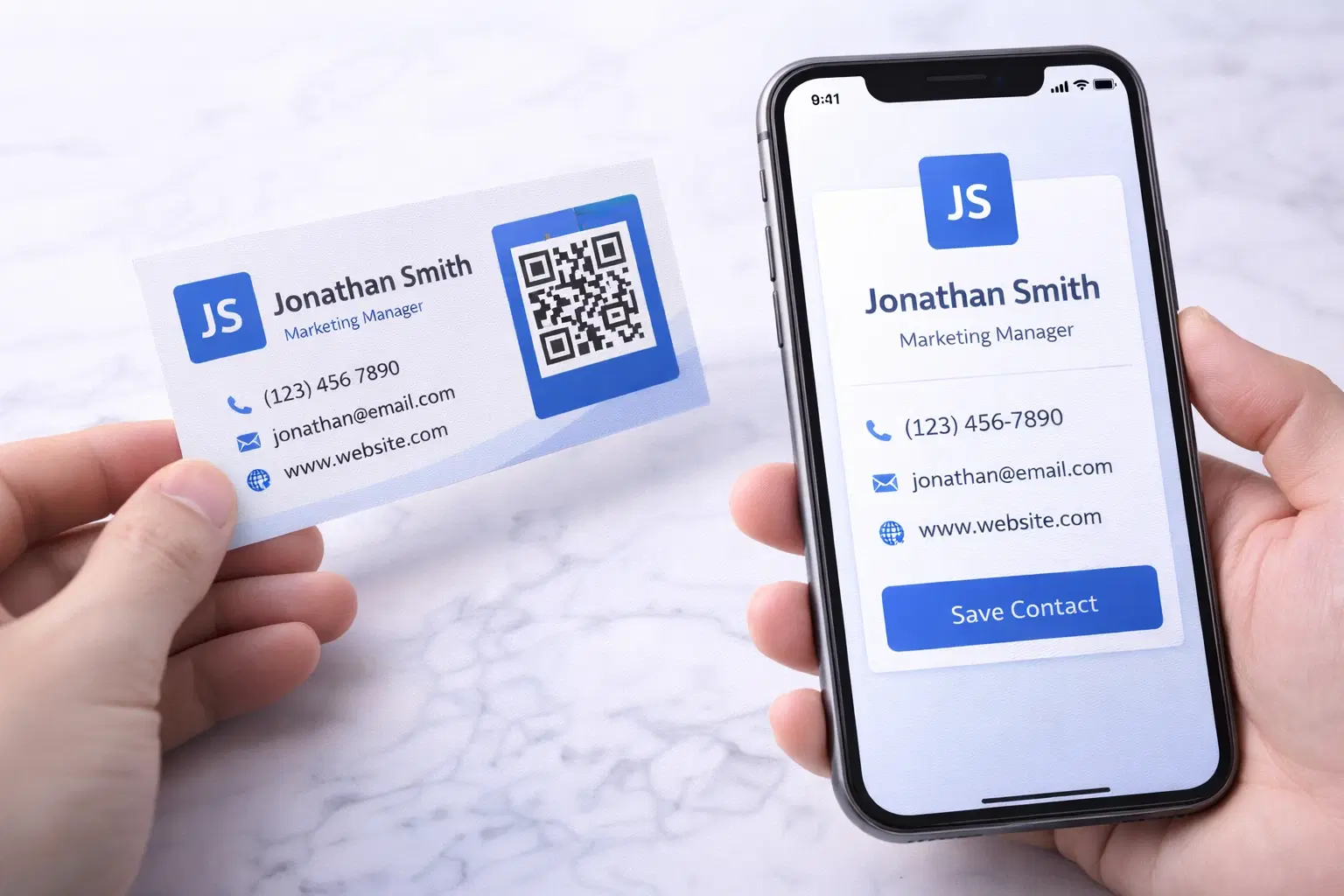
vCard QR Codes: The Complete Guide to Digital Business Cards (Updated 2026)
Create a vCard QR code that shares your contact info instantly, and updates itself when your job, phone, or email changes. Complete guide with placement strategy and networking scripts. Updated September 2026.
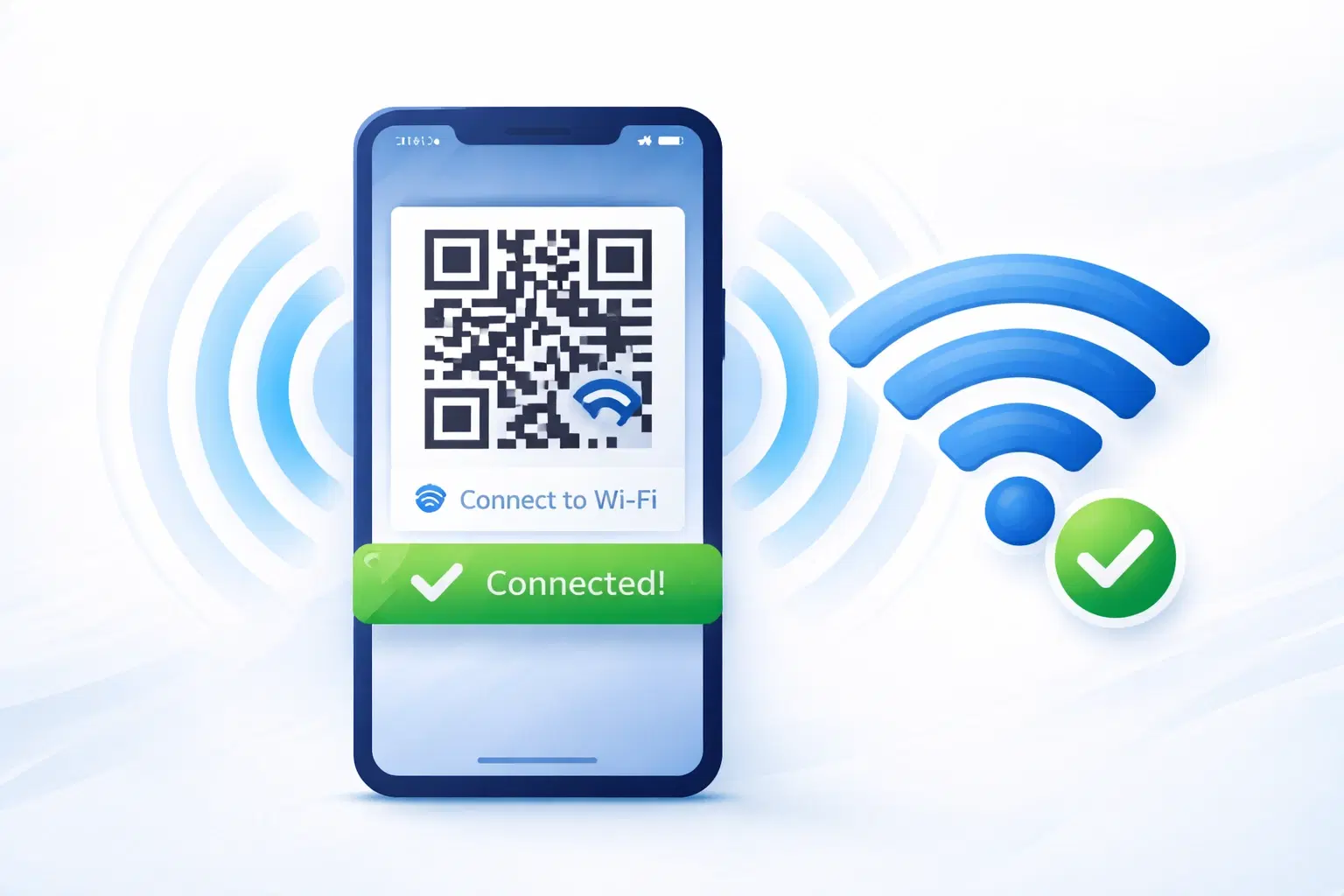
WiFi QR Codes: How to Share Your Network Password Instantly (Updated 2026)
Stop spelling out WiFi passwords letter-by-letter. WiFi QR codes let guests connect in seconds: for your home, café, hotel, or office. Updated 2026 setup guide with platform-specific instructions.

How to Set Up QR Code Check-In for Events: Step-by-Step Guide 2026
Replace paper lists and manual check-ins with a fast, contactless QR code system. Full setup guide for conferences, workshops, weddings, and corporate events.