How to Add a Logo to a QR Code Without Breaking It (2026)
Adding your logo to the center of a QR code makes it look professional and on-brand, but do it wrong and the code stops scanning. Here is exactly how to add a logo to a QR code safely, using error correction, sizing, and testing.

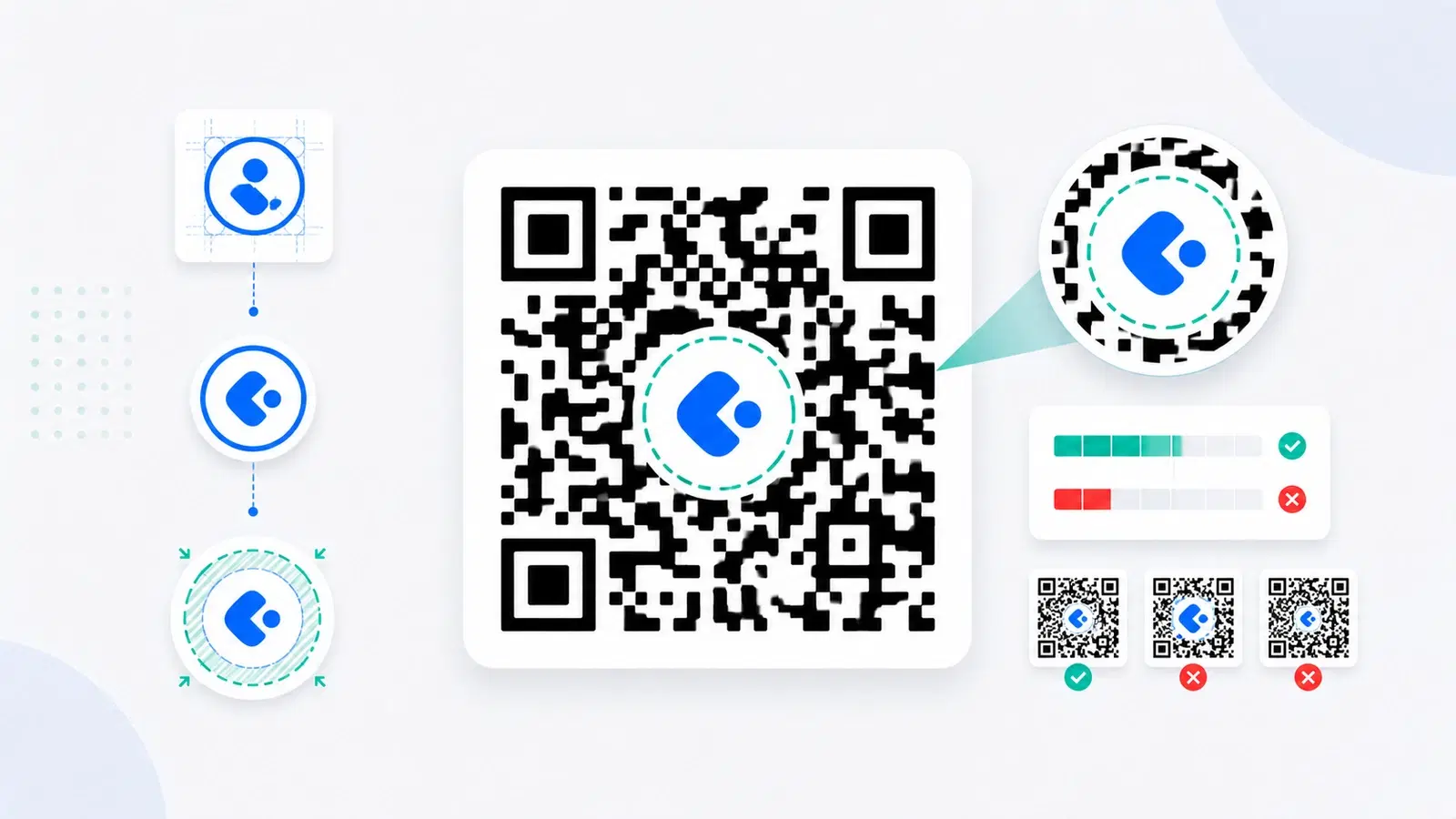
A QR code with your logo in the center looks professional, builds trust, and turns a generic pattern into a branded asset. It is one of the most popular customizations, and for good reason. But it also carries a real risk: a logo covers part of the code, and if you cover too much or place it carelessly, the code stops scanning.
The reassuring part is that QR codes are designed to tolerate a surprising amount of obstruction, thanks to built-in error correction. That is exactly what makes a center logo possible. The key is working within that tolerance rather than blowing past it. Add a logo the right way and the code stays perfectly scannable; add one the wrong way and you get a beautiful code that fails in the field.
This guide explains why a logo works at all, how to use error correction to your advantage, how big a logo can safely be, where to place it, and how to test. This is a focused, step-by-step how-to; for choosing among tools with logo features, see our roundup of the best QR generators with logo support, and for broader visual design, the design and branding guide.
Why You Can Put a Logo on a QR Code at All
It might seem surprising that you can cover part of a QR code and still have it work. The reason is a feature built into every QR code: error correction.
Error correction is redundancy. QR codes store their data with deliberate redundancy, so that even if part of the code is damaged, dirty, or covered, the remaining pattern contains enough information to reconstruct the whole. This is why a slightly scratched or smudged code still scans, and it is exactly what a center logo relies on: the logo "damages" a portion of the code, and error correction fills in for it.
There are four levels of error correction. QR codes come in four error-correction levels, each able to recover from roughly a certain amount of obstruction:
- Level L (Low): recovers from about 7% damage
- Level M (Medium): about 15%
- Level Q (Quartile): about 25%
- Level H (High): about 30%
Why this matters for logos. The higher the level, the more of the code can be covered before it fails. A logo in the center covers some of the pattern, so a higher error-correction level gives you more room for that logo. This is the single most important setting when adding a logo. See error correction levels explained for the full detail.
The tradeoff. Higher error correction adds more redundant data, which makes the pattern slightly denser (more, smaller modules). That is a minor cost and well worth it for a logo. The density is rarely a problem as long as you keep the code a sensible size, which the size guide covers.
Use High Error Correction (Level H)
The first and most important step to adding a logo safely is turning up error correction.
Choose Level H for logo codes. When you plan to add a center logo, set the code to error-correction Level H (High), which tolerates roughly 30% obstruction. This gives your logo the most room while keeping the code reliably scannable. Most generators that support logos either default to a high level or let you choose it; make sure it is set to H (or at least Q) for any code with a logo.
Why not just always use H? For a plain code with no logo, a lower level is fine and keeps the pattern simpler. But the moment you add a logo, the extra tolerance of Level H is exactly what keeps the code working. For logo codes specifically, H is the right default.
H is a budget, not a license. Even at Level H, you can only obscure so much, roughly 30% at the absolute theoretical maximum, and in practice you want to stay well under that for a safety margin. Error correction gives you a budget for the logo; it does not make the code immune. The next section is about spending that budget wisely.
Combine carefully with other customizations. Remember that color, low contrast, and a logo all draw from the same overall readability budget. If you are also coloring the code, be even more conservative with logo size, since you are asking the code to tolerate two things at once.
Pro Tip
Always set logo codes to error-correction Level H (High). It roughly triples the obstruction the code can tolerate compared with the lowest level, which is precisely the headroom a center logo needs. If your generator does not let you raise error correction, it is not a good tool for logo codes.
Keep the Logo Small and Centered
Error correction gives you room; sizing and placement decide whether you stay within it.
Keep the logo modest in size. Even though Level H tolerates around 30% obstruction, a good practical guideline is to keep the logo covering roughly 20% or less of the code's area, and to treat 30% as a hard ceiling you do not approach. A smaller logo scans more reliably across more devices and conditions. When in doubt, make the logo smaller; a logo that is a bit smaller than you would like still brands the code, while one that is too big simply does not work.
Place it dead center. The center of a QR code is the safest place for a logo, because the critical alignment and finder patterns live at the edges and corners. Keep the logo centered and away from the three large corner squares (the eyes) and the code's borders. Covering or crowding those corner patterns is a fast way to break the code.
Keep the logo clean and simple. A simple, high-contrast logo works best. A busy or low-contrast logo, or one with fine detail, is both harder to recognize at small size and more disruptive to the code. Simple marks read better in the center of a code.
Consider a small clear buffer. Many logo codes look best (and scan better) with a little clean space around the logo, so it sits in a small clear area rather than jammed directly against the surrounding modules. This keeps the transition between logo and pattern clean.
Do not resize the logo up after the fact. Set the logo size in the generator and export a high-resolution or vector file. Do not take a finished code and manually enlarge the logo in an editor, that pushes past the tested tolerance and can break a code that worked.
- Keep the logo to roughly 20% of the code area; treat 30% as a hard ceiling
- Center the logo; keep it away from the three corner eyes and edges
- Use a simple, high-contrast logo, not a busy or finely detailed one
- Leave a small clean buffer around the logo
- Set size in the generator, do not enlarge the logo manually afterward
Step by Step, and Always Test
Here is the full, reliable process for adding a logo to a QR code without breaking it.
The steps: 1. Create a dynamic code so the destination stays editable after branding and printing. See dynamic vs static. 2. Set error correction to Level H (High). 3. Upload a simple, high-contrast logo, ideally with a transparent background so it sits cleanly. 4. Keep the logo small and centered, around 20% of the code area, away from the corners. 5. Maintain contrast and the quiet zone in the rest of the code; if coloring too, be conservative. 6. Export a high-resolution or vector file for crisp results. See SVG vs PNG.
Then test, every time:
- Scan with multiple phones, including an older one, in normal and slightly dim light.
- Test at the final size on the real material before any large print run. A logo code that scans on screen can behave differently printed small.
- If it hesitates or fails, make the logo smaller and test again. Shrinking the logo is almost always the fix.
Why testing is non-negotiable. A logo pushes a code closer to its limits than a plain code, so the margin for error is smaller. Ten minutes of real testing across devices and at final size is the difference between a branded code that works everywhere and one that quietly fails on the exact phones your customers use. See why codes fail to scan if you hit trouble.
Done this way, a logo makes your code look professional and trustworthy while scanning just as reliably as a plain one.
Conclusion
Adding a logo to a QR code is one of the best ways to make it look professional and on-brand, and it works because QR codes have built-in error correction that lets them tolerate part of the pattern being covered. The trick is to work within that tolerance instead of exceeding it.
The recipe is simple: set error correction to Level H, keep the logo small (around 20% of the code area, never approaching 30%) and centered away from the corner eyes, use a simple high-contrast mark, and maintain contrast and the quiet zone in the rest of the code. If you are also coloring the code, be even more conservative, since color and logo spend the same readability budget.
Then test, always, on multiple phones and at final size on the real material, because a logo narrows the margin for error. When a logo code hesitates, shrinking the logo is nearly always the fix. Follow this and you get the best of both worlds: a branded, trustworthy code that scans every single time.
Related reading:
Create a branded QR code with your logo on QRForever. Start a 7-day full-access trial, no credit card needed. Add your logo with high error correction and a live preview, so it scans every time.
Explore QRForever Solutions
Ready to Create Your Own QR Codes?
Start creating dynamic QR codes for your business today. Track analytics, update content anytime, and never reprint again.
Related Articles
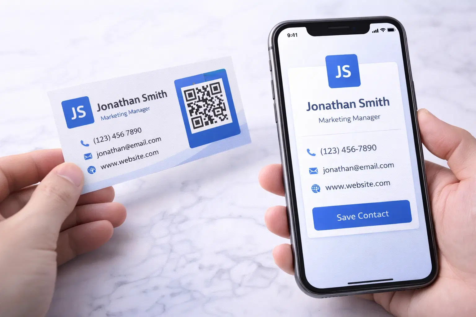
vCard QR Codes: The Complete Guide to Digital Business Cards (Updated 2026)
Create a vCard QR code that shares your contact info instantly, and updates itself when your job, phone, or email changes. Complete guide with placement strategy and networking scripts. Updated September 2026.
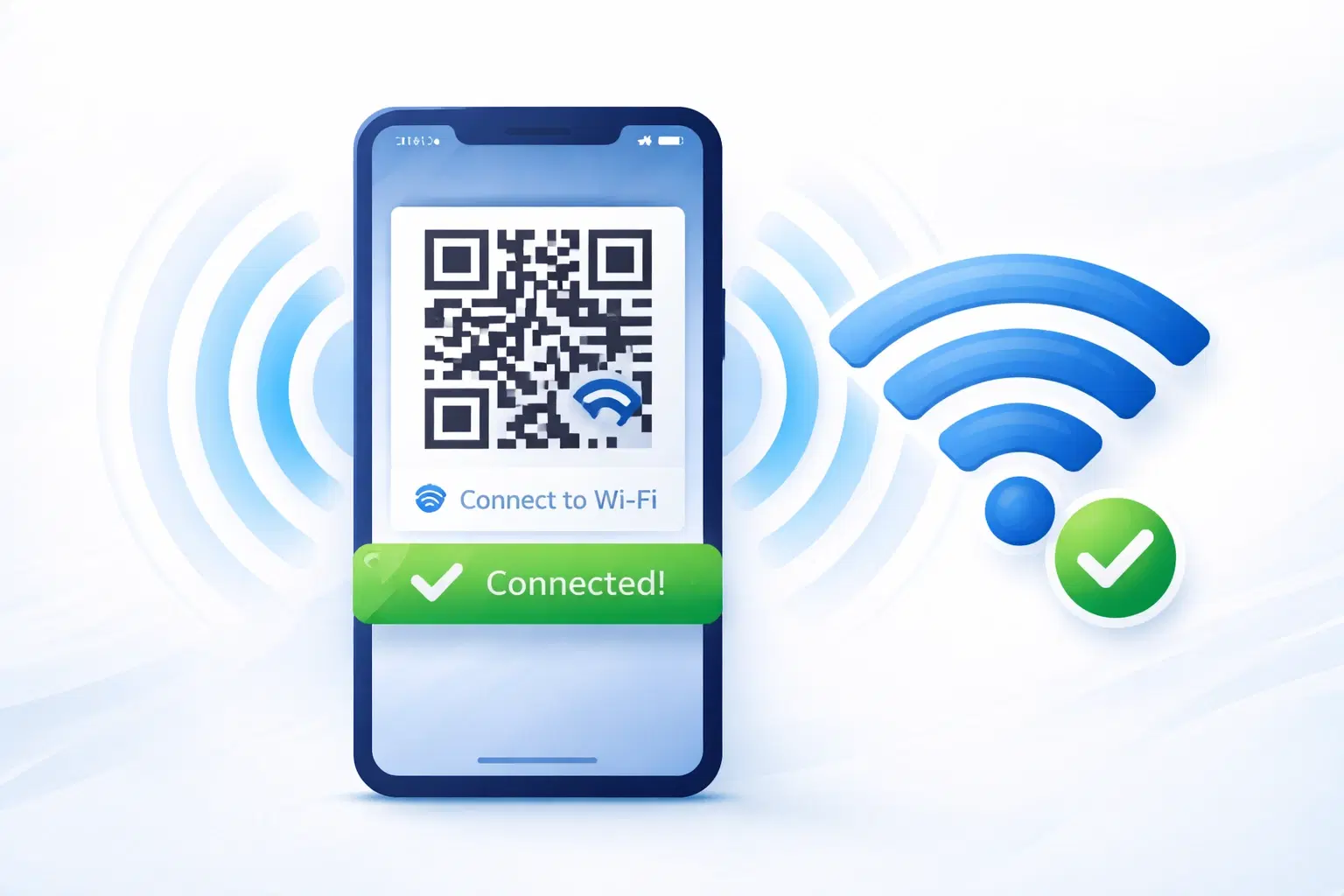
WiFi QR Codes: How to Share Your Network Password Instantly (Updated 2026)
Stop spelling out WiFi passwords letter-by-letter. WiFi QR codes let guests connect in seconds: for your home, café, hotel, or office. Updated 2026 setup guide with platform-specific instructions.
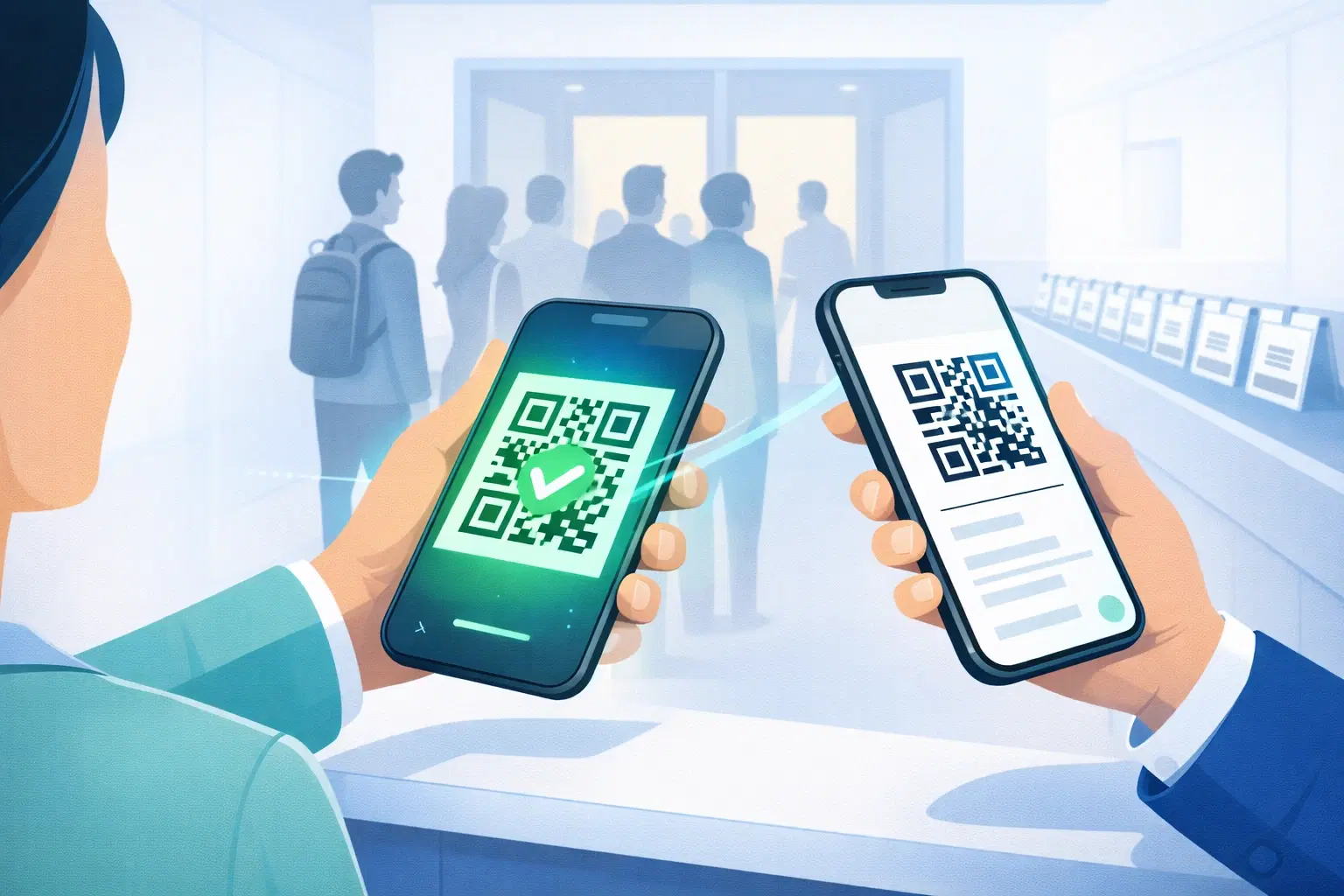
How to Set Up QR Code Check-In for Events: Step-by-Step Guide 2026
Replace paper lists and manual check-ins with a fast, contactless QR code system. Full setup guide for conferences, workshops, weddings, and corporate events.