How to Make a Rounded or Custom-Shape QR Code (2026)
Rounded dots, custom eye shapes, and styled QR codes look modern and on-brand, but push the styling too far and the code stops scanning. Here is how to make a rounded or custom-shape QR code that looks great and still works in 2026.

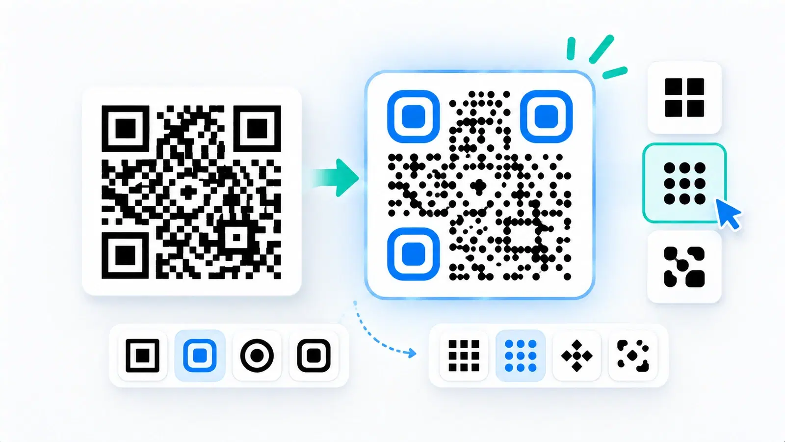
The classic QR code, a grid of hard black squares, looks a little dated next to the sleek, rounded, branded codes you see on modern packaging and marketing. Rounded dots, custom corner shapes, and subtle styling make a code feel designed rather than pasted on. The good news is you can absolutely style a QR code this way. The catch is that styling changes the code's appearance, and pushed too far, it changes whether the code scans.
This guide shows you how to make a rounded or custom-shape QR code that looks modern and stays reliably scannable. It is a focused design how-to: which elements you can safely style, how far you can push each, and how to confirm the result still works. For broader visual design (color, logos, full branding), see our design and branding guide; here we concentrate specifically on shape and dot styling.
The guiding principle throughout: a QR code is a functional pattern first and a design element second. Style it to look great, but never at the cost of the scan.
What You Can Actually Style
Modern QR generators let you style several distinct parts of a code. Knowing what each part is helps you style confidently without breaking anything.
The data modules (the "dots"). These are the many small elements that make up the body of the code and carry the data. You can usually restyle them from hard squares to:
- Rounded dots - softened, circular or rounded-square modules (the most popular modern look)
- Connected or fluid styles - modules that join into smooth shapes
- Other shapes - diamonds, dots, and similar variations
This is the main lever for a modern look, and it is generally safe in moderation.
The finder patterns (the "eyes"). The three large squares in the corners help scanners locate and orient the code. Most generators let you restyle these, the outer frame and the inner dot, into rounded or custom shapes. Styling the eyes has a bigger impact on recognizability than styling the dots, so this is where more caution is needed (more below).
The overall frame and background. You can add a frame, a call-to-action, colors, and a logo. These sit around or within the code rather than changing the core pattern shapes. For "scan me" frames specifically, see QR code frames and CTAs.
What you cannot change: The underlying arrangement of light and dark, the actual pattern, is fixed by the data. Styling changes how the modules look, not where they are. That is why strong contrast still matters no matter the style: scanners read light versus dark, so your styled modules must stay clearly dark on a clearly light background. See how to make a colored code that scans.
How Far You Can Push It
The art of a styled code is knowing how far each element can go before scannability suffers. Here are sensible limits.
Rounded dots: generally safe. Switching the data modules to rounded dots or a mild connected style is usually fine and is the single most effective change for a modern look. Scanners handle rounded modules well, as long as contrast stays strong and the rounding is not so extreme that adjacent modules blur together or nearly disappear. Moderate rounding: safe. Extreme, barely-there dots: risky.
Custom eye shapes: style with more care. Rounding the corner eyes is popular and usually works, but the eyes are critical for scanner orientation, so keep them recognizable as the distinct corner markers they are. Gentle rounding is fine; heavily distorted, tiny, or low-contrast eyes are a common cause of a stylish code failing to scan. When in doubt, keep the eyes closer to standard than the dots.
Contrast is non-negotiable, whatever the shape. No amount of styling overcomes weak contrast. Keep dark modules on a light background. A beautifully rounded code in two similar mid-tones will not scan. This is the rule that underlies all the others.
Do not over-combine. Styling, color, and a logo all draw from the same "readability budget." A rounded, colored code with a center logo is asking the scanner to cope with three departures from the plain standard at once. Each is fine alone; stacked aggressively, they can tip a code into unreliability. If you are doing several, be conservative with each and test harder. See how to add a logo without breaking it.
Use error correction as a safety margin. A higher error-correction level gives a styled code more tolerance. It is not a license to over-style, but it adds resilience. See error correction levels explained.
Important
The most common styled-code failure is over-styling the finder patterns (the three corner eyes). Scanners rely on them to locate and orient the code, so heavily distorted, shrunken, or low-contrast eyes break scanning even when the rounded dots look great. Keep the eyes gently styled and clearly recognizable; push the dots further than the eyes.
Step by Step: Style It Safely
Here is a reliable process for creating a rounded or custom-shape code that looks modern and scans every time.
1. Start with a dynamic code. So you can fix the destination later without reprinting, and so styling is purely about appearance while function stays flexible. See dynamic vs static.
2. Apply a moderate rounded dot style. Choose rounded dots or a mild connected style for the data modules, this gives most of the modern look with minimal risk.
3. Gently round the eyes, if you like. Apply a subtle rounded style to the corner eyes, keeping them clearly recognizable as corner markers. Do not shrink or heavily distort them.
4. Keep strong contrast. Dark modules, light background. If adding color, keep the code genuinely dark against a genuinely light background.
5. Add a logo only if needed, and keep it small. If you want a center logo, keep it modest and centered, and lean on higher error correction. See how to add a logo without breaking it.
6. Preserve the quiet zone. Keep the clear margin around the code; do not let styling or frames crowd the pattern.
7. Export crisp. Download a vector (SVG) for print so the styled shapes stay sharp at any size. See SVG vs PNG.
Then test, which is the step that separates a stylish working code from a stylish broken one.
- Start with a dynamic code (appearance separate from function)
- Apply a moderate rounded dot style to the data modules
- Gently round the eyes, keeping them clearly recognizable
- Keep strong dark-on-light contrast, whatever the style
- Add a logo only if needed, keep it small, raise error correction
- Preserve the quiet zone and export as crisp vector (SVG)
Test Harder Than Usual
A styled code departs from the plain standard scanners handle most easily, so it deserves more testing than a basic code, not less. This is the step that protects you.
Test on multiple phones. Styling that scans instantly on a new flagship phone can struggle on an older or budget device. Scan your styled code on several phones, including an older one if you can. Real scanners vary, and your audience uses all of them.
Test in real conditions. Try it in normal and slightly dim light, at the distance and size it will actually be used, and on the real material if printing. A styled code that scans on your monitor up close may behave differently printed small on a glossy package. See why codes fail to scan and the size guide.
If it hesitates, dial the styling back. The fix for an unreliable styled code is almost always to reduce the styling: less extreme dots, more standard eyes, stronger contrast, smaller logo. Step back toward the standard until it scans instantly every time, then stop. A slightly less adventurous code that always works beats a bolder one that fails on some phones.
The balance to aim for: The goal is the maximum modern style that still scans instantly on every device in real conditions. That line is usually: moderately rounded dots, gently rounded recognizable eyes, strong contrast, and a small logo at most. Within those bounds you get a code that looks designed and works flawlessly, which is exactly the point.
The bottom line: You can absolutely have a rounded, modern, on-brand QR code. Just remember it is a functional pattern first: style it confidently within the limits, test it harder than a plain code, and never let the look compromise the scan.
Conclusion
A rounded or custom-shape QR code can look genuinely modern and on-brand, and it is entirely achievable, as long as you respect that a QR code is a functional pattern first. Style the data modules with rounded dots for most of the modern look at low risk, gently round the corner eyes while keeping them recognizable, and hold strong dark-on-light contrast no matter what, because scanners read light versus dark, not your styling.
The biggest trap is over-styling the finder patterns or stacking too many departures (shape plus color plus logo) at once, each of which eats into the code's readability budget. Use higher error correction as a safety margin, keep the quiet zone clear, and export crisp vector files for print.
Above all, test harder than you would a plain code: multiple phones including an older one, in real light and at real size. If it hesitates, dial the styling back toward standard until it scans instantly every time. Aim for the maximum modern style that still works flawlessly on every device, and you get the best of both: a code that looks designed and scans every single time.
Related reading:
Create a styled, scannable QR code with QRForever. Start a 7-day full-access trial, no credit card needed. Rounded dots, custom eyes, and a live preview so it always scans.
Explore QRForever Solutions
Ready to Create Your Own QR Codes?
Start creating dynamic QR codes for your business today. Track analytics, update content anytime, and never reprint again.
Related Articles
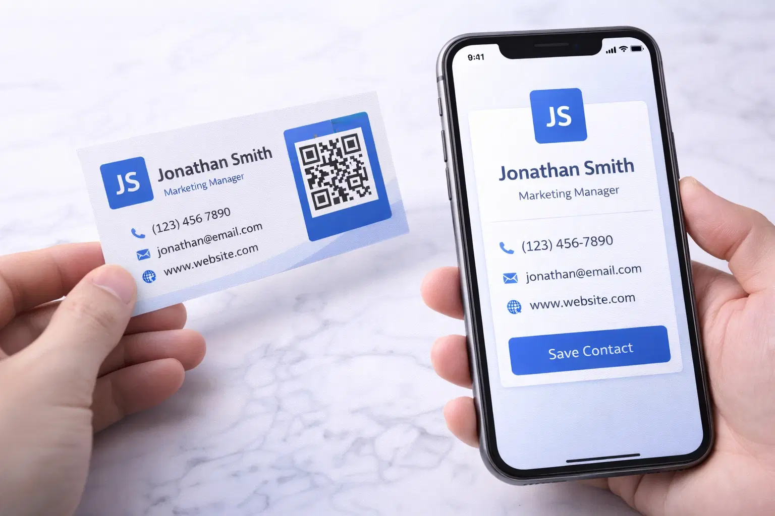
vCard QR Codes: The Complete Guide to Digital Business Cards (Updated 2026)
Create a vCard QR code that shares your contact info instantly, and updates itself when your job, phone, or email changes. Complete guide with placement strategy and networking scripts. Updated September 2026.
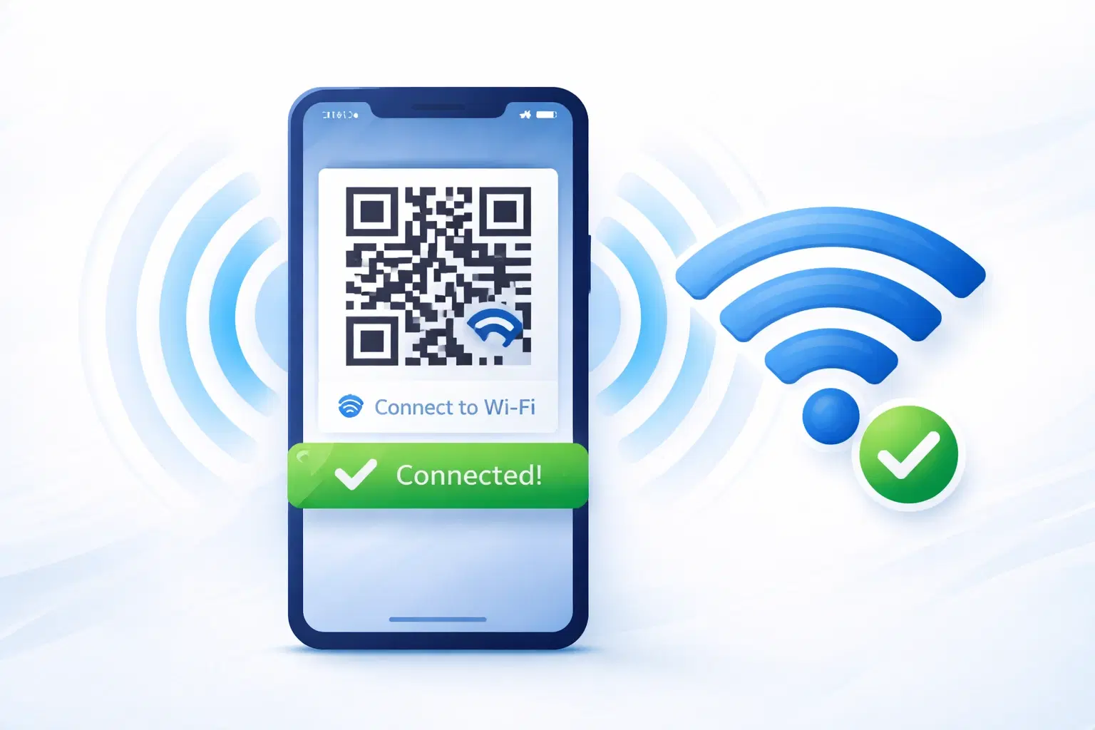
WiFi QR Codes: How to Share Your Network Password Instantly (Updated 2026)
Stop spelling out WiFi passwords letter-by-letter. WiFi QR codes let guests connect in seconds: for your home, café, hotel, or office. Updated 2026 setup guide with platform-specific instructions.

How to Set Up QR Code Check-In for Events: Step-by-Step Guide 2026
Replace paper lists and manual check-ins with a fast, contactless QR code system. Full setup guide for conferences, workshops, weddings, and corporate events.