QR Code Design Trends 2026: What Is In, What Is Out
QR code design has matured past the novelty phase. Heavy gradients and artistic distortion are out; restraint, contrast, and confident branding are in. Here is what is working in 2026, and what to avoid.


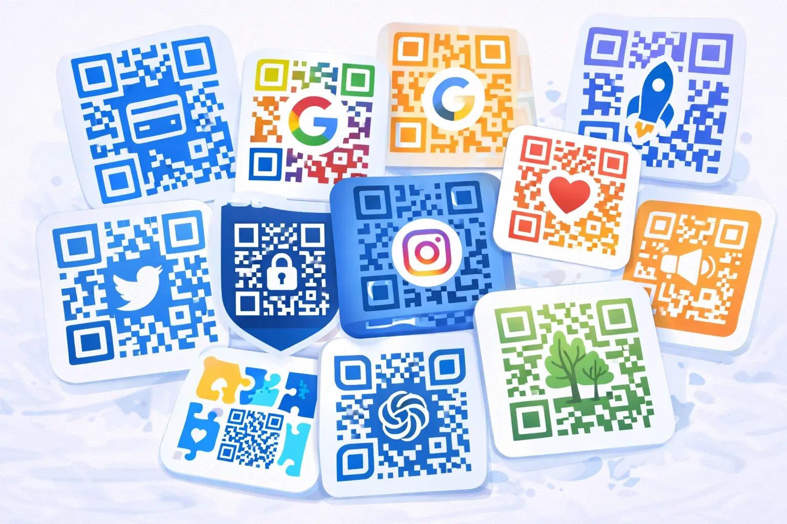
QR code design went through a predictable arc. When customization tools arrived, everyone went maximalist: gradients, custom dot shapes, oversized logos, artistic distortion, codes shaped like objects. It was fun, and a lot of it did not scan.
By 2026 the pendulum has settled somewhere more useful. The dominant aesthetic is quiet confidence: high contrast, clean shapes, a modest logo, and restraint. Designers have learned that a QR code is a functional interface element first and a branding surface second, and the best ones look intentional rather than decorated.
This guide covers what is genuinely working in QR design right now, what has fallen out of favor and why, and the constraints that separate a code that looks good from one that looks good and actually scans.
What Is In: Restraint and Confidence
The prevailing 2026 aesthetic is understated. Here is what good QR design looks like now.
High contrast, unapologetically. Dark code on a light background, or the reverse. Not "on brand but low contrast." The most confident designs treat contrast as non-negotiable and find brand expression elsewhere, in the frame, the typography, or the surrounding layout.
Subtle rounded modules. Slightly rounded dots or squares rather than hard pixels. It softens the code and reads as considered, without the scannability cost of dramatic custom shapes. This is the single most common "modern" QR treatment, and it works because it is a small deviation from the standard.
A modest, well-integrated logo. A small logo in the center, sized well within the error correction budget, with clean spacing around it. Not a logo fighting the code for dominance. The best examples read as one object rather than a logo pasted onto a pattern.
Branded frames and calls to action. Rather than distorting the code itself, designers put the brand work in a frame around it: brand color, a clear instruction, a shape that fits the layout. This is the smartest trend of the last two years, because it gives you brand presence at zero scannability cost.
Single accent color. One brand color used decisively (usually as the module color against white) rather than multi-color gradients. Cleaner, more legible, more recognizable.
Generous quiet zones. Designers stopped treating the white border as wasted space. A generous quiet zone reads as deliberate and confident, and it is functionally required. See our QR code design guide for the fundamentals.
Pro Tip
The most reliable modern QR aesthetic: high contrast, subtly rounded modules, one brand color, a small centered logo, and a branded frame carrying the call to action. It looks current, it scans everywhere, and it will still look fine in three years.
What Is Out: The Maximalist Era
Several treatments that felt fresh a few years ago now read as dated, and most of them were fighting the format.
Heavy multi-color gradients. Gradients across the whole code reduce contrast unpredictably, especially where light and dark bands meet the module pattern. They also age quickly, in the same way heavy gradients dated other design work. Mostly gone from serious brand use.
Dramatic custom module shapes. Stars, hearts, leaves, and heavily stylized dots. They looked novel, they scanned inconsistently, and the novelty wore off fast. Subtle rounding replaced them.
Oversized logos. Logos covering a third or more of the code, relying on maximum error correction and hoping for the best. Designers learned this is where "worked in testing, failed in the field" comes from.
Artistic distortion and object-shaped codes. Codes warped into logos, product silhouettes, or scenes. Genuinely impressive when done by experts with heavy testing, but a reliability gamble for everyone else. Rare now outside high-budget campaigns.
Low-contrast "on-brand" codes. Pastel on cream, mid-gray on light gray, dark blue on black. These were the most common cause of codes that failed in dim light or on cheap print. Designers now treat contrast as a constraint rather than a variable.
Why the shift happened: Two things. First, enough codes failed publicly that the reliability cost became obvious. Second, QR codes became ordinary. When a format is novel you decorate it; when it becomes infrastructure you make it work well and get out of the way.
Important
Most of these "out" trends are not just unfashionable, they are the specific choices that produce codes which scan on your phone during design review and then fail on a customer's older phone in a dim restaurant. Fashion is the smaller reason to avoid them.
The Constraints That Define Good QR Design
Every trend that survives respects the same handful of constraints. Designers who internalize these can be creative safely.
Contrast is a hard floor, not a preference. The code must be clearly darker or lighter than its background, in the worst lighting it will realistically face. Dim restaurant, bright sunlight, cheap print. If contrast is marginal in ideal conditions, it fails in real ones.
The quiet zone is structural. The clear margin tells the scanner where the code ends. Crowding it with text, imagery, or a page edge breaks scanning regardless of how good the code looks.
Logo size is governed by error correction, not taste. A logo covers part of the pattern, and error correction has to absorb that. Keep the logo modest and pair it with high error correction. See our error correction levels guide.
Size is set by scanning distance, not layout convenience. A code shrunk to fit a corner is a code that does not scan. Size it for the distance it will be scanned from. See our QR code size guide.
The medium changes the rules. Fabric, curved surfaces, and low-quality print all reduce your margin for stylistic risk. A design that works on a glossy card may fail on a t-shirt. See printing QR codes on apparel.
Test in the real conditions, not the mockup. Print it at final size, view it in the actual environment, scan it with an older phone. This single habit catches most design failures before they ship.
- Contrast is a hard requirement, judged in worst-case lighting
- The quiet zone is structural, never decorative space to reclaim
- Logo size is governed by error correction budget, not visual preference
- Size is set by scanning distance, not by what fits the layout
- Fabric, curves, and cheap print shrink your margin for stylistic risk
- Always test at final size, in the real environment, on an older phone
Where to Put the Brand Work Instead
The most useful shift in QR design thinking is this: stop trying to brand the code, and brand everything around it.
The frame is your canvas. A branded frame around the code gives you color, shape, typography, and a call to action, with zero effect on scannability. This is where the strongest 2026 designs put their personality.
The call to action does more than the styling. A specific instruction ("Scan for tonight's specials") outperforms any amount of visual decoration, because it addresses why someone would scan rather than how the code looks. See the psychology of QR code scanning.
The surrounding layout carries the brand. On a menu, a poster, or packaging, the code sits inside a designed environment. That environment is where brand recognition actually happens. The code just needs to be clean and obviously scannable.
The destination is part of the design. What loads after the scan is where the brand experience really lands. A beautiful code leading to a slow, unstyled page is a failure of design, not just development.
The practical division of labor:
- The code itself: functional, high contrast, clean, modest logo
- The frame and layout: brand color, typography, personality
- The call to action: the actual persuasion
- The destination: the brand experience
Designers who split responsibilities this way get codes that look current, scan reliably, and convert better. Trying to make the code itself carry the branding is what produced most of the failures of the maximalist era.
Conclusion
QR code design in 2026 has matured in the way most formats eventually do. The experimentation phase produced some genuinely impressive work and a lot of codes that did not scan, and the field settled on restraint.
What is in: high contrast, subtly rounded modules, one confident accent color, a modest well-integrated logo, generous quiet zones, and branded frames carrying the call to action. What is out: heavy gradients, dramatic module shapes, oversized logos, artistic distortion, and low-contrast codes chosen to match a palette.
The through-line is a shift in thinking. A QR code is a functional interface element, and the brand work belongs around it rather than inside it. Designers who accept that constraint end up with codes that look more considered, not less, and that keep working in the dim, cheap, real-world conditions where codes actually get scanned.
Related reading:
Design a branded QR code with QRForever. Start a 7-day full-access trial, no credit card needed. Logo embedding applies the right error correction automatically.
Explore QRForever Solutions
Ready to Create Your Own QR Codes?
Start creating dynamic QR codes for your business today. Track analytics, update content anytime, and never reprint again.
Related Articles
QR Code Design Guide: Branding, Colors, and Customization (Updated August 2026)
A plain QR code is a missed branding opportunity, but bad design makes codes unscannable. This 2026 guide covers colors, logo placement, error correction, and the exact rules that keep branded QR codes working. Updated June 2026.
QR Code on Business Card: Complete Design Guide for 2026
Everything you need to know about adding a QR code to your business card: what to link it to, where to place it, minimum size, and design rules that actually look professional.